



What Makes a Group Shirt Design Readable
A shirt is read from across a gym, not at arm's length. Why bold simple designs survive and fine detail disappears on fabric.
Almost every disappointing group shirt fails the same way: it looked great on a laptop and disappeared in the room it was made for. Part of Custom Apparel Guides & How-Tos.
Design for the distance it gets read at
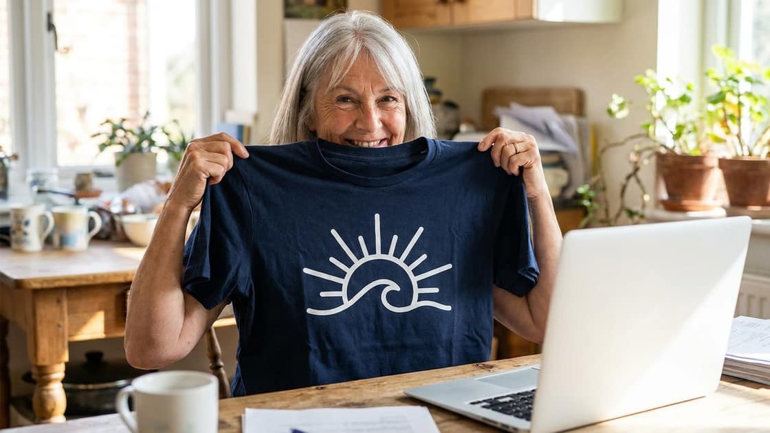
A shirt is read from across a gym, from the far bleachers, from a parking lot. That is thirty to a hundred feet - not the eighteen inches you are sitting from your screen right now.
Zoom your design out until it is about an inch wide. If you cannot tell what it is at that size, nobody at the game will either.
What survives, and what does not
| Survives | Does not |
|---|---|
| Bold shapes | Thin script |
| Heavy type | Hairline outlines |
| High contrast | Drop shadows, and gradients between similar tones |
| One strong idea | Anything with more than a few small elements |
Fabric is textured and absorbent - fine detail that renders perfectly on a screen softens on cotton.
Three or four words, not a paragraph
The designs that work are usually a name and one more thing: a year, a mascot, a short phrase the group already says. Once you are past about four words, the type has to shrink, and shrinking is what kills legibility.
Anything long - a full quote, a list of sponsors, a roster - belongs on the back, or on the program, or nowhere.
Bigger than feels comfortable
The most common self-inflicted mistake is shrinking a design so it looks tasteful on screen. On an actual shirt that reads as a small mark floating on a large blank chest, and in photos it vanishes.
Our print areas run up to about 13 to 15 inches wide depending on the garment. Using most of that width is normal, not loud.
Remember it will be photographed
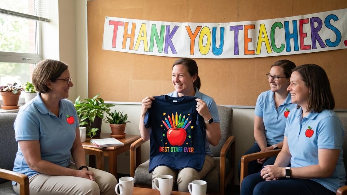
Group shirts end up in a photo - the team, the reunion, the crew on the last night. That photo is the design's real audience, usually viewed small on a phone. Contrast is what carries at that size, so pair light ink with a dark garment or the reverse. The color guide covers which pairings hold up.
Front first, overflow on the back
The chest is the panel people read first, so everything on it has to earn its place; the back and sleeves are where the overflow goes. The first surface is included in the price; each extra one is $8.99 to $10.99 depending on the product.
Got a logo file rather than an idea? See preparing artwork files first.